Sunday, December 14, 2008

A Layout Grows in Brooklyn

Or, more accurately, from Brooklyn. And not Brooklyn, NY, but the Brooklyn Basin* area of Oakland, California. I wrote a while back that my layout building efforts in the garage had been waylaid by impending home remodeling. So I decided to focus for now on a shelf layout in our spare bedroom home office.

My proto-freelanced Oakland Harbor Belt's Brooklyn Basin District represents a mix of real-life and imagined industries. In real life, the actual industries were served by the Southern Pacific (now Union Pacific). In my version of reality, the OHB also curves along Oakland's Inner Harbor, serving some industries jointly with the SP and some on its own.


The N scale shelf layout will be built on wall standards, providing space for desks and office equipment below. There may be a few small changes to the track plan before construction, but I think this will be pretty close to the final configuration.


You can read more here about my imagined enhancements to real life and my N scale layout plans for Brooklyn Basin. Hopefully the New Year will bring some actual layout construction updates.

*I'm not sure how the area came to be called Brooklyn Basin, but the name dates back at least to the late 19th century. The area at one time was apparently more of an actual drainage basin, but there has been substantial building on fill since then.

Sunday, December 07, 2008

Beer and Dekaohtophyllia

No, it's not the title of the next Jerry Springer show. "Beer" is a reference to Model Railroader magazine's interesting new MILW Beer Line project layout series (beginning in the January 2009 issue) and "dekaohtophyllia"* is my pidgin Greek for "love of the number 18".

The Beer Line layout is an intriguing and welcome departure from the more typical "Plywood Central" 4X8 HO model railroad designs that have often been featured by MR in past layout construction projects. David Popp's thoughtful track plan is divided into sections that can be combined in multiple configurations. In fact, they are a bit more like modules since there is a consistent location for the "main line" at the section edges.

MR has chosen mainly real-life industries and locales for the layout, and it promises to be more advanced than some of their project layouts in that kitbashing specific prototype structures is suggested. And of course, the emphasis on switching vs. endless round-'n-round is inherent in the choice of prototype line.

By merely taking saw to plywood 4X8 "sacred sheets", MR broke out of one of the strictures of the traditional "beginner" layout. And it appears there will at least be a suggestion of a separate staging yard to be attached, another nice element often lacking in project layouts of the past.

In my mind, all of these elements are very welcome. MR is encouraging beginners to look beyond the traditional HO 4X8, to cut some wood (or have it cut), and to consider real places and industries as subjects for model railroading. All of this may make for a more engaging and satisfying long-term model railroading experience. So far, very good.

And yet, the design sticks to 18" radius HO curves for most of the "main line", even taking the curved side of Atlas Snap Switches in a couple of locations. And why does this "love of eighteen" frustrate me a bit? It's simply this: MR broke the mold in so many positive ways with this project, and in theory could have used any radius for these curves. So why perpetuate the myth that 18" radius is perfect for newcomers to HO layout-building? Elsewhere in the design, significant use is made of PECO Code 83 #5 and #6 turnouts. A somewhat broader curve and the elimination of the Snap Switches would have brought the rest of the layout in alignment with those components. (OK, and they could have done without the switchback industry spurs that require clearing one industry to switch the adjacent one – but I digress.)

My best guess is that it was just too hard to break out of the four foot width dictated by the standard sheet of plywood. Instead, the design requires only one lengthwise cut of a 4X8 sheet and the addition of a couple of "Handy Panel" pre-cut 2X4 sheets. But it would not have taken much effort or space to increase the size of the end sections and permit the use of 20" or slightly larger flextrack curves. Why would this matter? Well, shoving cars through the curved side of a Snap Switch and around 18" radius HO curves can be a bit of a challenge if the track is not laid with care. A slightly larger radius offers more room for error in building and more reliability with a wider variety of equipment in use. It just seems to me to be an opportunity lost to demonstrate that once one is willing to take saw to the sacred sheet, it opens up many alternatives impossible on an unsullied HO 4X8.

My view on this appears destined to be unpopular. When I mentioned it on one forum, I was attacked by a rabid pack of MR defenders. "Beginners don't have room for 48" radius curves, you know!" Yes, I know, but this straw man argument is moot. I'm not talking about changing the 18"R to 48"R. Maybe 20" -- or 19" -- or 23". "Beginners already have 18" sectional curves from their train set, you can't expect them to throw those out!" Huh? Saving a handful of track sections that could be replaced with ten bucks' worth of flex is a reason to potentially compromise operation and reliability for years to come?

The irony is, I'm a big fan of MR generally, and of this project specifically, just not the 18" radius in this case. (By way of comparison, the beginner's project published as an insert this month in Railmodel Craftsman cuts the plywood and uses broader radii but is perhaps the worst beginners design suggestion I've encountered in print in years.) I even used some 18" radius (with easements) recently in an HO custom design that will be published in the New Year where those sharp curves replicate some tight-quarters real-life harbor trackage and contrast with broader curves elsewhere in the design.

The Beer Line project was an opportunity to show the hobby something different and flexible that could give many people a fresh way to approach layout design and construction. In so many ways, it succeeds. But the tie to 18" HO trainset curves and Snap Switches fails to fully capitalize on the opportunity, in my humble (and apparently unwelcome) opinion.

* Yes, I know the actual Greek root would be spelled "-philia", but thanks for the emails. I just thought this spelling was funnier and that's why I called it "pidgin" Greek.

Sunday, November 30, 2008

Dull Plan, Engaging Layout?

A wrote a while back about my inexpert first model railroad layout design, criticizing myself for the model railroad cliché of "an industry in every corner". In response, my friend Robert Bowdidge asked me later if I thought a good design must always look visually interesting and unique as a track plan. Robert, who is building a fine Southern Pacific based HO layout, noted that he had tried some exotic-looking benchwork shapes in his design before concluding that a more common U-shaped approach ultimately yielded a better configuration for the layout in the alotted space. And having operated on Robert's layout, I can vouch for the fact that the longer, straighter legs of the "U" make for better representations of the switching areas and an appealing operating experience.

Certainly I have seen this is also true for many of my own custom model railroad design projects. Sometimes my clients seem a little disappointed that the benchwork outline is so plebeian. But real-life railroads sought to have the longest, straightest tangents possible, using only the curves necessary to join those tangents. The model railroad benchwork shape that yields more of those straight areas will often be a good choice. There are exceptions, of course, especially for mountain-crossing routes. But even in those real-life situations, the most interesting operating areas (towns, yards, etc.) were often located on relatively straight stretches.

The same goes for schematics. A lot of the newcomer layout design efforts we see posted on the Internet serve up a multitude of routes and cross-connections more akin to a pasta bowl than to creating a plausible model railroad. But unfortunately for the real-life railroads, there are no secret hidden paths between Chicago and Los Angeles that cut off the intervening mountain states. So the more realistic schematic tends to be sequential and not variable.

A layout designed with a relatively straightforward benchwork footprint and a linear schematic can still be intensely engaging and visually interesting when built, even if the 2-D track plan is somewhat plain. Thoughtful track arrangements and operating patterns along with the skillful use of viewblocks and scene separators can make the actual layout a very satisfying experience to visit and/or operate. It's the subtleties of layout design that set apart engaging layouts from random collections of track. I wrote about some of these in my series on the Tricky Traps of Layout Design and Track Plan Analysis.

So for me, wild benchwork footprints, tricky multi-path routes, and a visually intriguing track plan diagram are usually secondary to more understated, but critical, design concepts that create long-term interest and enjoyment.

Friday, November 14, 2008

Port Layouts on Podcast

I had the chance to spend some time with Will Ayerst, one of the proprietors of the Model Railcast Show last week, talking about port-themed model railroad design and operation. Our audio session was recorded and is available for free download on the site as Show #38. My discussion with Will begins about 30 or 40 minutes into the show.

Model RailCast is an interesting alternative in model-railroad themed media. I never tire of hearing myself talk, so it was fun for me. Whether it's interesting for anyone else (and thus, whether I'll be invited back), remains to be seen.

Sunday, November 09, 2008

Schoof's "Free Haven Terminal" – Inspirational Layout #8

As I've discussed the layouts in this series, I've described how a number of them started me thinking more about terminal switching areas and rail-marine environments. But one in particular was the key that unlocked my inner rail-marine modeler -- Russell Schoof's Free Haven Terminal from Model Railroader, October 1990 (also in 48 Top Notch Track Plans, Kalmbach, 1993).


Track plan copyright Model Railroader magazine, used with permission

Click here for a larger image in a new window

Schoof's layout packs a lot into 10X11 feet in HO, albeit with the use of some pretty tight curves. A decent-sized yard offers some room to work, and a variety of industries and terminals provide reasonable destinations for a good mix of freight cars. Some industries are larger, with realistic multiple tracks. Separate inbound- and outbound freight houses are a rarity on other model railroad track plans, but were common in real life during the less-than-carload (LCL) era. The published plan also has some secluded staging below, reached by a John Armstrong-style "vertical turnout" at the left of the diagram.

There are a few shortcomings that I would try to correct if adapting Schoof's Free Haven Terminal plan for my own use. I might opt for staging behind the backdrop on the same level ("surround staging") with a lift-gate across the room entrance to allow a continuous-path option. With that change in staging, the way the track goes off-scene through the walls of one of the freight houses could be reworked to be a little less contrived. Some of the industries are a bit generic, so choosing signature industries that would add more port-side personality would help. A dedicated yard lead would be a help with multiple crews working. And certainly there would be room to work in a car float, one of my favorite rail-marine features, to add an element of interchange. There are a few other quibbles, but the overall concept is very sound.

I'm apparently not the only one who has been inspired by this design. A group of four French modelers has built a very fine N scale sectional layout called the Free Heaven Harbor Terminal that shares many features of Schoof's Free Haven Terminal design, even the passage through the freight house to staging. Here's their track plan and a scene from their former website. (Their former address has been taken over by a malware site, so don't look for it.) The layout was also featured in a french-language magazine.


Another element that makes Model Railroader's article on Schoof's Free Haven Terminal article so inspiring to me is the inclusion of suggestions for operation and some of the neat "artist's conception" perspective line illustrations that were often featured in MR articles of the era. These provide a hint of what the final layout might be like and add to the rail-marine atmosphere (even though some of the views are admittedly from angles that might not actually be possible on the layout).

Like many of my inspirational layouts, the Free Haven Terminal seems of an eminently "do-able" scope. I've been impressed and educated by dozens of other layouts in person and in the press, many of them large, decades-long efforts. But this handful of mostly more modest inspirational layouts still excites and motivates me personally to get off my duff and build something. I hope they've done a bit of the same for you.

Read the entire Inspirational Layouts series

Sunday, October 26, 2008

Alameda and Galveston – Inspirational Locales #7

For something a little different in this series, two real-life locales that continue to inspire me in model railroading. Both were covered in magazine articles with accompanying model railroad layout plans, but it's the prototypical locales themselves that had the lasting influence. These are the places that helped set the stage for my later interest in rail-marine and portside railroading.

The Alameda Belt Line on its namesake island near Oakland in California has been in the back of my mind since reading about it in Barry Wood's article in the April 1980 Model Railroader. This little line had a lot of interesting elements: ownership by, and interchange with, the Santa Fe and Western Pacific (via car float and car ferry for much of its life); character-filled industries; an interesting competition with the Southern Pacific; and a reasonably compact scope. My interest in it has only increased since moving to the Bay Area.

Wood's article included a track plan, primarily focusing on the Alaska Basin area of the prototype. While it's a pretty good plan, it was set in an era after the car floats and ferry had stopped running and did not reflect some of what I feel were the signature elements of the prototype, like the dual interlaced wyes. The area Wood focused on is still pretty interesting, with a wide variety of industries, some quite large:


I've been including some aspects of the ABL in my plans for my own N scale Oakland Harbor Belt Layout for some time. For example, the Alaska Basin area will look something like this when I get back to the garage version of the OHB.


Click here to read more about Alaska Basin on the OHB.

One of my friends has said, "Byron, you're obsessed with the ABL. Why not just model it instead of making something up?" Fair question -- and if there were decent Alco S-2s in N scale who knows if I might have taken that path -- but then again, the freedom of proto-freelancing offers the chance to include more traffic and other engaging elements lacking in the real-life ABL.

Galveston Island, Texas is another fascinating rail-marine environment, well described in Cyril Durrenberger's and Tom Eishenhour's May 1983 MR article on the Galveston Wharves Terminal Railway (GWT). While this article also includes a reasonable track plan, the real attraction to me was the map spread across the top of two facing pages: huge industries, wharves, piers, grain elevators, and container facilities; four major interchanging roads (SP, ATSF, BN, GH&H [MP-controlled]); and wide variety of commodities.

The concentration of railroading created by the port facilities makes for an amazing variety and scope of potential modeling. Maybe a little too much scope, in fact … while the ABL might be too small, Galveston is probably just too big. I've done one custom design inspired by Galveston so far, but it's hard to capture even a hint of the signature elements of the prototype on a mid-size or smaller trackplan. Maybe another opportunity will present itself one day. Today the GWT is known as the Galveston Railroad (AAR reporting marks GVSR). Those reporting marks are seen on thousands of Golden West Service cars across the country.

So, while it wasn't the model railroad track plans that appealed to me in these cases, the attractions of the real-life rail-marine prototypes were definitely a huge inspiration to my modeling concepts and vision today.

Next time, I'll conclude this series with a layout that, while far from perfect, puts many of the elements described so far into practice. Anyone have a guess which layout it might be?

Sunday, October 19, 2008

Rick Mugele's "City Belt" – Inspirational Layout #6

If you were to combine an innovative design imagination, the experience of real-life railroading, an interest in small-space operations, and an intriguing locale, you might, if you were very lucky, end up with Rick Mugele's HO 42"X80" City Belt switching layout. Besides the visible trackage seen here, one double-ended and two single-ended tracks are tucked below the visible yard, providing interchange and additional industries assumed to reside "beyond the benchwork".


Click here for a better view of the HO City Belt switching layout

Rick Mugele is a real-life railroader (now on the BNSF), and for years he has cranked out amazingly compact designs that challenge conventional thinking and stretch the envelope of what's possible. By 1995, when I encountered his City Belt design in a back issue of the Layout Design SIG's Layout Design News (LDN-8, August 1991), I was beginning to realize that model railroad operations could be a lot more engaging than I had imagined. Mugele's article described the real-life concept of "sure spots": cars aren't dumped willy-nilly into sidings, rather in many places they are required to be placed at a particular door, over an unloading grate, or below a discharge spout. The City Belt was provided as an example, based on real–life industries in Oakland and Richmond in California served by the (then) ATSF.

As compact as it is, the City Belt layout contains a couple of dozen "sure spots" – offering the same operations interest as much larger layouts that lack this added sophistication and realism of precisely spotting cars as on the prototype. This small layout includes key realism-boosting features that are lacking in the majority of the switching layout designs proliferating unchecked on the Internet (and even in the commercial press).

These all-too-seldom-seen desirable features include interchanges and yards – places for the loads and empties to travel to- and from. Industries are (relatively) large, with multiple tracks and multiple spots on many of those tracks, just like the real thing. Even in these tight quarters, there are no double-ended switchbacks that would require one industry to be emptied before another may be switched. For example, the "Safeway Lead" (my designation) extends into the lower right corner to allow room to work without disturbing cars already placed at other industries. And a pair of run-arounds allow everything to be shuffled as required to be placed into spot order for the facing- and trailing-point industries.

It took me a while to fully appreciate another interesting feature: Mugele's use of double-sided backdrops. Combined with the different levels of trackwork, it allows a clever and efficient "overlap" of layout space. For example, the lead into the Safeway building passes below the visible yard directly above it and the Safeway complex's walls form an industrial building bay at GATX as well as creating the backdrop between the scenes.

Beyond these design elements, Mugele's City Belt radically changed my thinking about operations. Besides just transportation (moving cars in trains), there was also the idea of distribution: efficiently picking up and placing cars at individual industries. And the idea that cars came from, and went to, "somewhere else" was clearly more realistic than moving a car from the vinegar plant three feet to the pickle factory and back again. I could see that even a small urban-themed layout could offer operating enjoyment by replicating some of the tight quarters and intricate switching of the real thing. (And Denton's Kingsbury Branch a couple of years later just added fuel to the fire!)

As much as I admire the City Belt, it's probably packed a bit too tightly to be practical for most builders as drawn. Curves wind down to less than 15" radius and grades are a stout 4 to 5% or more. But building this same layout in a 5'X8' or 5'X9' in HO would allow one to ease many of these issues and improve accessibility to the hidden track. Or, as suggested by Frank Jozaites in LDN-8, the yard could be swung off to the side as a shelf on an adjoining wall, a very nice improvement if space is available. In N scale, the layout might fit well on a hollow-core door (and would be a real improvement over many of the switching layout designs proffered for that space).

The most creative layout designers not only render innovative track plans, they show us ways to make whatever layout space we have more engaging and satisfying. Rick Mugele certainly falls into that category, and his City Belt still inspires me today.

Friday, October 17, 2008

"Old" Media or "New"? The Answer is "Yes"

Model railroading media is a bit of a two-headed beast. On the one hand, many model railroaders tend to be technology-savvy. OK, let's face it, we're geeks (at least many of us). On the other hand, the hobby also attracts an older demographic that is often not as computer-friendly. So for every cry of, "Just publish everything on­-line", there's an answer of "I like my paper magazines".

Personally, I don't think this is an either/or question. Certainly, circulation for all genres of printed media (not just model railroading publications) is down with the advent of the Internet. But I don't agree with those who claim that printed magazines will disappear in the next few years. And the reason I believe printed media will survive is that there is still an important difference in user experience between on­line media and printed publications. That difference might be described as "hunter" versus "gatherer".

In my experience, using on-line media is a hunting expedition – I'm usually looking for specific things that pique my interest. I'm not likely to read every forum posting, for example. Instead, I'll look through the topics to find the two or three that interest me and look only at those. Part of this is the sheer volume of chaff, but some of it is just the times, places, and tools that pertain when I am consuming this media (sitting in front of the screen).

Conversely, for me the printed publication lends itself to a "gatherer" approach. I'll thumb through all the pages of a magazine and linger briefly on a wider variety of topics, including some that might not otherwise interest me during a more purposeful "hunt". I can browse through a book or magazine while waiting at the dentist's office, before retiring, or while in the euphemism. For me, this less-structured, more exploratory way of consuming media is vital: it exposes me to new ideas and different approaches I wouldn’t necessarily delve into through more directed on-line reading.

And importantly, much of the on-line material is inherently self published – there usually are no editors for web pages (more's the pity). For me, editors often add value by contributing rigor, context, and focus. I appreciate printed publications partly because most have passed through an editorial step (although sometimes with the smaller publications it's hard to tell!). I also think there's value in the structure of a book or printed magazine. The author's and editor's construction, pacing, and organization add flavor and meaning to the objective facts.

So my basic premise is that print won't die anytime soon – partly because it provides a different kind of experience (at least for those like me). What I think will happen is continued evolution of both on-­line and print media in model railroading. As an example, I think Kalmbach has done a decent job of extending their Model Railroader and Trains brands into cyberspace. This is challenging for a publication that has historically depended largely on print ad revenue to survive. And make no mistake, business plan transformation is orders of magnitude tougher than the nuances of on-line fonts and formats. [As an aside, one of the major issues roiling the newspapers isn't primarily that readers are abandoning them – it's that Craigslist and eBay took the classified advertising!] Kalmbach has had some on-­line stumbles along the way, but the company is miles ahead of its model railroading publication competitors. I think they have done a reasonable job of bringing some of their editing and publishing strengths to the Internet. (And it's interesting to note that as Kalmbach incorporates more ads to create a viable revenue stream on­line, there are complaints from users. We do want it all, and all for free, don't we?)

On the Internet side, consider Joe Fugate's new ad-supported electronic magazine, Model Railroad Hobbyist, set to premier in January. On the surface, it's a pure "new media" model. But Joe has a long history not only as a video and web technology practitioner, but also as an editor and publisher of enthusiast printed publications, both in model railroading (the LDSIG's Layout Design Journal in the late '90s) and in other fields. I think (and hope) that Joe will bring some of the editing discipline typical of the print world to his e-zine venture. In my mind, Joe has the skills and experience to build this into a unique and successful publication.

I think we'll find that the ultimate result isn't wholly either/or, on­-line or print. We'll see blending and crossover. As a writer, I've got a foot planted firmly in each camp, with future articles scheduled for publication both on-­line and in print. I do spend a lot of time looking at the screen … but there are times to settle down with a great printed book or magazine, too.

The Inspirational Layouts series returns in the next post.

Sunday, October 12, 2008

Sperandeo's San Jacinto Dist. – Inspirational Layout #5

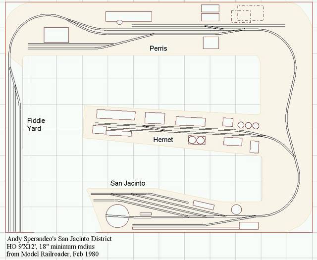
When the student is ready, the track plan appears. Or reappears, in this case. When I first saw Andy Sperandeo's 9X12 HO ATSF San Jacinto District plan in the February 1980 Model Railroader, it didn't make much of an impression. (Especially compared to the Carrabasset & Dead River in the same issue).

But by the time I encountered the plan again in the early 1990s, in Kalmbach's Track Planning Ideas from Model Railroader (1981), I had learned enough about model railroad layout planning to see and appreciate the track plan's innovative points.


The modest amount of trackwork that had seemed sort of boring before now looked much more realistic. Linking the plan to real places and the actual types of industries found in those locations created more interest. A layout based on out-and-back branch line switching, rather than endless round-and-round, seemed attractive. And the accessible staging, which had seemed like a waste of perfectly good layout space to me earlier, now enabled the engaging flow of traffic to- and from the "rest of the world". (This might have been the first time I was exposed to the concept of a fiddle yard, where consists might be reset between sessions.)

The San Jacinto District was not the first layout I had seen with most of these elements, but I was beginning to see how creating a track plan was an exercise in balance. Sperandeo's track plan was one of the few "theoretical" designs in that era to realistically address the need for adequate aisles, for sufficient staging to create the desired operations intensity, and a variety of operating schemes to address seasonality (and add operating interest). Sperandeo's track plan also exuded a personality – the atmosphere of southern California branch line railroading. This was a refreshing change from many of cookie-cutter layouts I had been seeing that seemed to all be set in the same generic eastern burg.

I was getting an inkling that there was more to model railroading than packing in loops of track. (Would that the masses posting their sorry CAD creations on the Internet might learn the same lesson.) Operating trackage, staging, room for scenery, operational theme, aisles for crew members, etc, all had to be considered in coming up with the track plan. Andy Sperandeo's relatively modest San Jacinto District plan inspired me to build my own knowledge of the myriad subtleties of layout design – a foundation I call upon nearly every day.


One of the more intriguing streaming audio channels I've come across is Frank's Americana on Live 365. Self-billed as "Cooking the music of the world in the melting pot of American life!", the channel mixes a wide variety of styles and eras. While bluegrass and newgrass are strongly represented, one might also hear Swing, Big Band, Jazz, and Rock. Ralph Stanley to Flying Burrito Brothers to James Gang to Louis Prima would not be an unusual set. There are occasional clinkers (some '60s Top-40 hits I just don't need to hear again -- ever), but there are far more nuggets than dross.

Tuesday, October 07, 2008

Denton's "Kingsbury Branch" – Inspirational Layout #4

1996 was a pretty stressful year: new baby; pressure-packed job at an Internet giant; and an impending household move. It was clearly going to be a while before any layout was started, but I was still planning on building the proto-freelanced N scale Midland Pacific* once things settled down. And then another seed was planted that would eventually shift me away from the branchline/secondary mainline concept to a more urban terminal-switching theme.


Kingsbury Branch layout photo from Bill Denton's former website


Bill Denton's Milwaukee Road Kingsbury Branch in the January 1997 Model Railroader was another revelation. In a very compact space – and in N scale – Denton had created an appealing replica of a real-life area that worked as an operating layout. The urban scenery was realistic without requiring scale acres of benchwork. And the concentrated activity typical of a real urban terminal provided plenty of engaging operating potential without unduly straining plausibility.


Track plans from Bill Denton's former site
The Kingsbury Branch is built in two portable sections, each measuring 21 inches deep by 6 feet long. An unscenicked 4‑track staging yard connects at the left of the upper section shown here (which also provides "room to work" for the industry tracks at the far left of that section). Denton's original inspiration came from an article by Randy Willis in the April 1975 issue of Model Railroader on the real-life area. From photos in that article and visits to the area, Denton developed a track plan that emulates the real thing in many respects, handlaying code 55 turnouts and code 40 industrial tracks to maximize appearance. He also decided to kitbash and scratchbuild, rather than using off-the-shelf structure kits, to try to replicate the buildings more accurately.

Looking at the layout photos, I realized that the urban buildings were strikingly effective as backdrops, towering over the railroad passing below. The busy trackwork intersected the street grid at interesting angles and suggested a real business with real work to do. And the many sidings, sufficient runarounds, "off-spot" tracks, and numbered door "sure spots" added realistic operating interest without resorting to tedious switching puzzles. Denton described the operation of the layout in a follow up article in the May 1998 MR. He has taken the layout to various train shows and events, a real benefit of the sectional approach. (The original intention was that these sections were to eventually become part of a larger home layout, but I don't know if that ever occurred.)

Of course, it didn't hurt that Denton is an excellent modeler and photographer. The images in the MR articles showed me that N scale urban railroading could appear very realistic in a very small space. While I didn't give up the Midland Pacific idea immediately, a new concept of urban railroading began to form. Bill Denton's Kingsbury Branch completely changed my perception of N scale and opened my eyes to the possibilities of urban railroading in a very inspirational way.

*My layout design and operating plans for the Midland Pacific were covered in detail in the Layout Design SIG's Layout Design Journal # 35, December 2006.

Sunday, October 05, 2008

Hayden's "C&DR" – Inspirational Layout #3

One might be reminded of the Sesame Street ditty: "One of these things is not like the others …" Bob Hayden's proto-freelanced HOn30 Carrabasset and Dead River Railway (C&DR) layouts might seem unlikely inspirations, given my current personal focus on industrial urban layouts intended for operation. Sometimes, though, an inspiring layout is one that tells you not only something about your dreams, but also something about your inescapable realities.


View of the Carrabasset and Dead River from Allen Keller's Great Model Railroads #26.

I discovered the C&DR on the cover of the February, 1980 Model Railroader. The story inside described the development of the first C&DR, from a rented garage in San Francisco to Dave Frary's basement near Boston. Although I knew nothing about the Maine two-footers at the time, the layout photos were amazingly evocative of a unique time and place, separated by gauge and locale from the rest of North American railroading.

Trains were short and engines idiosyncratic. And the idea that a layout could evolve so dynamically over time as the builders' ideas changed and experience grew was a very new and exciting concept.

For a brief time, I was enthusiastic about modeling in HOn30 myself. "Brief" as in about a week -- once I discovered the paucity of commercial offerings in the local hobby shops, my ardor quickly cooled. And more importantly, I began to realize that it took a special combination of skills to make such an unusual prototype believable. Those early C&DR layouts benefited not only from Hayden's vision, but from both Hayden's and Dave Frary's exceptional modeling and scenery skills as well (thus the C&DR is justifiably one of MR's Landmark Layouts).

The low-key imagineered C&DR prototype encouraged space between scenes and uncrowded towns. But for that concept to succeed, the scenery had to be top-notch -- which in this case, it was, the builders having literally written the book on model railroad scenery. Even though the idea of an isolated and charismatic little railroad was very appealing, I began to recognize that pulling it off successfully would require space and modeling talent that I currently lacked. And the absence of meaningful interchange is an operating limitation that I could see would be unsatisfying.

So in a roundabout way, my interest and enthusiasm for the C&DR has translated into a focus on a more achievable (for me) concept: an industrial switching-oriented layout, the Oakland Harbor Belt. The OHB concept can justifiably cram more operating interest into my limited space and may not be as demanding of scenery skills to pull off convincingly.

The appeal of isolated little railroads continues for me, of course, in the form of my recurring infatuation with Hawaiian railroads. As I have read and enjoyed the many articles on the C&DR, I still find the layouts very inspiring and motivating. Hayden's unique concept and the builders' masterful implementation (aided and abetted by Frary's fine photography) always encourage me to get building. And certainly that qualifies the multiple instantiations of the Carrabasset and Dead River concept as very inspirational layouts, indeed.

Friday, October 03, 2008

Rule #1?

There is an old adage in model railroading that describes "Rule #1" as: "It's my layout, I'll do what I like". Folks invoke "Rule #1" to justify double stack container trains pulled by old-timey 2‑6‑0s and French TGVs blasting around 1950s Pennsy layouts. Some folks also call upon "Rule #1" to rationalize all manner of dubious model railroad layout design choices: weird switchback industries, convoluted multi-path routes, etc.

For me personally, it's all good. If those are choices someone wants to make for their own layout, more power to them. One of the best parts about model railroading is the creative aspect that results in no two layouts looking the same. I do think it's a shame when a newcomer with questions is assaulted by one of these "Rule #1" types. "Who cares, it's only a hobby – we're all playing with trains – do whatever you like" is a common refrain.

Even stipulating that model railroading is indeed a hobby and not brain surgery, I think that is a disservice to a newcomer who doesn't know the best practices of the hobby or the whys and whens of real-life railroading. Personally, I think it's good to have some background on what works best in model or real-life railroading before deciding on a path that's really divergent. But hey, if you want to build a multi-path spaghetti bowl with four passes of track through each visible scene, knock yourself out!

What's been interesting to me is the number of Rule #1-ers who want me to agree with their choices. A byproduct of my modest little model railroad layout design service and published articles in the model press is that some folks seek me out to accost me with their "innovative" design ideas (many of which are throwbacks to 50-year-old modeling practices, by the way). These folks seem almost desperate to get my approval for their choices.

First, it's pretty silly to think that my approval matters. I'm just an opinionated lunkhead with a blog. (Wait … is that redundant?) Second, they've already chosen something they know I won't agree with – does it really seem likely that their pitch will be so persuasive that I'll be converted? "Oh gee, you're right, an 18" radius helix in HO is a great idea. And I'm sure the resulting grade will be no problem for your UP Big Boy hauling that Amtrak Superliner consist!"

One fellow (details changed slightly to protect the unconvinced) showed up at two of my clinics at the recent NMRA National Convention in Anaheim. Gripping his precious CAD HO 4X8 layout plan printout, he buttonholed me after each clinic to show me his unique approach. When I gently explained that the 6% grades and 15" radius curves seemed an unlikely match for his heavy mainline theme, he tersely responded with -- wait for it -- "Well it's my layout and I'll do what I want!" Fair enough. But if that's the case, why ask metwice?

The same thing happens in forum and email exchanges. I try to suggest to folks that there is a reason some trackwork configurations are unsatisfactory: they've been found not to work as well as others. It's not some shadowy model railroad-industrial complex that's conspiring to keep them secret. But still, people seem anxious for me to agree with these poor ideas, especially if they first saw them in a published track plan.

Bottom line, if you're going to invoke Rule #1 for your own layout, fine by me. But if you feel some trepidation about the path you're on, maybe it's because there is a reason for some concern. Spending some time learning about model railroad layout design best practices and real-life railroad practices will help you make an informed decision when you decide to diverge from the well-traveled path.

Next post, the Inspirational Layouts series returns ...

Friday, September 26, 2008

Westcott's "Switchman's Nightmare" – Inspirational Layout #2

Although I wasn't actively doing any model railroading in the late 1970s, I was still reading books and magazines and thinking about layouts. Like probably everyone in the hobby at that time (and many today), I owned a copy of Kalmbach's 101 Track Plans for Model Railroaders. Once, while visiting out-of-town friends, I came down with a nasty flu bug. While my friends went out for the day's activities, I resigned myself to the TV and reading, including another pass through the copy of 101 Trackplans I had brought along on the trip.

I had been through the book a couple of times at this point, focused mainly on the larger layouts in the later pages. So I decided to take a look at the smaller plans in the front of the book. Loop. Loop. Loop. Hey, wait a minute. Maybe it was my somewhat febrile state, but I started to see something different in plan #6, Linn Westcott's "Switchman's Nightmare".


For the first time, I pictured how cars placed in the yard at the right might be delivered to industries and vice-versa. And for some reason, the tracks at the lower left struck me as a large industry this time, rather than another yard as I had seen it before. Grabbing some scratch paper, I drew crude representations of short trains and tore the paper into little bits. As I moved these around the diagram in the book, I started to really understand what a runaround was, why those switch leads at the upper left and lower right where there, and how even a small layout without a continuous run might be fun.

Although the fever (both literal and model railroading) passed, the concepts of the Switchman's Nightmare layout stayed with me. As I learned more about multi-spot industries and prototypical operations, I began to see possibilities for more complexity and interest in Westcott's compact shelf switching layout.

Part of the appeal of this layout is its structural simplicity: runaround; yard tracks; and industry tracks, creatively overlapped to make the best use of the limited space. This basic structure has been used in hundreds (maybe thousands) of layouts, including John Allen's more-famous but less-realistic (in my view) Timesaver switching game. (It's interesting to me to note that the Switchman's Nightmare predates the Timesaver by about a decade.)

Even though regular readers know how much I dislike the traditional HO 4X8 track plan, an interesting exercise is to use the Switchman's Nightmare configuration as a an HO 4X8.


I've used similar configurations in a number of small layouts or as part of larger layouts, including the 1'X6' N scale Alameda Belt Line design from Model Railroad Planning 2005. Another interesting adaptation I've done was an HO version sized and configured much like Westcott's original but set up as a diesel service facility for a client with only a modest space but a mess o' engines to display.


The basic Switchman's Nightmare layout can be improved, where space permits, by the addition of a bit of length to allow for longer and more useful switch leads and runaround. I've seen a version on the web built by a club that had removable extensions to be added to the switch leads at each end when used at shows. Designating the tracks on the lower left as the multiple tracks of a large industry (factory, paper mill, brewery, etc., etc.) with sure spots could provide a lot of operating interest. And yeah, the switchback industries at the upper right bug me a little but could be easily addressed.

That a very simple trackwork configuration could offer such richness of operation was, and continues to be, a delightful surprise and ongoing inspiration. Just proves that "there's almost always room for operations" -- and that definitely places Westcott's little gem in my list of Inspirational Layouts. When the series returns, something completely different.

Monday, September 22, 2008

Whither the NMRA National?

I've been thinking a bit lately about the NMRA National Convention concept. I've attended three now, beginning in 1996 in Long Beach, then 2005 in Cincinnati and recently this year's event in Anaheim. The NMRA National is a bit of a model railroading smorgasbord, and I tend to graze the offerings, rather than indulge in all of it.

But that still leaves a lot of activities for me during the convention. Because I operate a modest model railroad-related business, the convention offers a chance to connect with current, past, and prospective clients, although much of that can be done through other means. I enjoy catching-up with friends from distant parts of the country and globe. I've always liked layout visits, but since I'm not one for bus tours, I usually only see layouts on the Layout Design SIG self-guided tours. It's fun to offer some short layout design help sessions as part of the LDSIG's activities. And with all of these, the thing I enjoy most is presenting and attending clinics.

The Host Committee of the Los Angeles Division of the Pacific Southwest Region did a fine job of organization and I enjoyed the events and activities of the convention. I also took a brief turn around the National Train Show (held in conjunction with the convention) and saw a few interesting things, including the modular layout set-ups that are my favorite part of any train show.

I'm not well-connected with the volunteer leadership of the NMRA (now there's a thankless job!), so I am not sure what their expectations were for attendance at the convention and participation by vendors at the National Train Show. But a few people were talking about the fact that the convention was more lightly-attended than hoped and that there weren't as many vendors at the train show as hoped-for. Part of this is probably that it was held on the west coast. I've certainly heard anecdotal reports that some attendees and vendors don't like to venture west of the Mississippi. (Of course, they don't mind asking those of us who live on the west coast to make the reciprocal trek.)

In any case, some of this discussion got me to thinking about the NMRA National Convention and what I would suggest to the NMRA if they were my marketing client and my task was to increase participation in the Convention. Now I don't know if any of the things I am going to mention are even possible to change or eliminate, or if there are reasons I'm not aware of that things are the way they are. So, unburdened by the constraints the NMRA likely actually faces, I'll blithely proceed to give my observations and opinions on four main points.

The hobby has changed

First, I think the hobby has changed in a fundamental way from the time that NMRA conventions began in 1935 and even from the 1960s and 1970s. There are a vastly broader range of interests, scales, backgrounds, products, etc., etc., than even a few years ago. This specialization of the hobby means that fewer of us are doing the exact same thing. There was a time when it seemed model railroading was almost entirely slightly whimsical western layouts. Then came the HO Appalachian coal haulers.

But today, we have eye-popping variety and more information than ever to let each of us explore our personal interests within the hobby even more deeply. Not just operations, but the intricacies of Time Table and Train Order. Not just diesel modeling, but duplicating exact phases of particular locomotives at a specific time and place. Not just a general interest in western prototypes, but participation in historical societies dedicated to preserving information on the day-to-day activities of a specific real-life railroad.

The NMRA National Convention is very tentatively beginning to become a "big tent" under which a number of specific groups offer activities, such as the Layout Design and Operations Special Interest Groups, the Railroad Prototype Modelers, and others. This is a terrific change from a decade or so ago when the SIGs were seen as rivals to the NMRA (sometimes, by both sides!).

But these SIG functions are still ancillary activities, in some cases exclusively for existing members of the groups. The Convention could be a chance for the NMRA to highlight these groups and many more, better communicating the diversity in the hobby and attracting more participation though partnerships with the SIGs, historical societies, and the like. Why not work to bring the Toy Train fans, the Narrow Gaugers, the N Scalers together in some way for a "Convention of Conventions"? Bigger buzz, bigger crowds, bigger benefit for the hobby in the long term … even if each of these constituencies has to give something up in the short term.

The world has changed

Second, I think it is important to acknowledge that the world has changed. The growth of the Internet has implications for the Convention and the Train Show. With forums and email, meeting and staying in touch with like-minded model railroaders does not require a national face-to-face get-together once a year. We can instantly connect with other modelers and see images of what they are working on – even on a daily basis, if we choose. And the same is true of model railroading vendors. Even the smallest garage-shop manufacturer can put up a website for practically nothing and be accessible to modelers around the world. No need to spend the significant time and money on travel and a booth at the Train Show.

In both cases, the Internet removes some impetus for the Convention and Train Show but conversely creates a terrific tool for promotion and partnerships. I can't remember seeing a single on-line ad for Anaheim in 2008. It's a huge effort, perhaps too much for a volunteer organization, but the NMRA could do a much better job of reaching out through the Internet to the many varied constituencies to bring them together for a more engaging and interesting Convention.

The seasons change

Third, it's always seemed odd to me that the Convention and train show are held in (usually) July. July! Not only is the weather a bit unpleasant (hot and/or muggy) almost anywhere in the US in July, it is the nadir of model railroading activity for most people. Typically people's model railroading juices get flowing in the fall and through the winter. I've been given two reasons for this date. One explanation is that this allows teachers and students to attend the Convention, which takes place during the week. The other is that convention facility costs are at their lowest in the middle of summer, when most people are on vacation.

Whatever the reasoning behind the July choice, I'm pretty sure that it doesn't make sense in today's world. People are more mobile, and even teachers can take time off in the fall and winter. Yes, students would have trouble participating during the week, but who says the Convention must take place primarily Monday through Friday (see below)? And most students would be better reached through the web and other activities than a convention that very, very few of them can afford, especially when travel is included. In my opinion, the Convention should move to the fall, when general modeling interest is higher.

Time for a change?
And the fourth topic to address, perhaps the elephant in the room, is the National Train Show. The Train Show dominates Friday and the weekend, which could be the prime days for people to participate in the Convention. It seems to me that the Train Show is the tail wagging the Convention dog. Now it may be that the fees the vendors pay to exhibit at the train show are an important component of the NMRA's operating budget, so maybe you gotta dance with the one that brung ya.

From its website, the National Train Show describes itself thusly: "The show's only purpose is to promote the hobby in a professional manner, to the hobby industry and to the public at large." Is this a mission that should still be carried out as a commercial show? Couldn't that be, indeed, shouldn't that be, the purpose of the Convention? Should the NMRA with its Train Show be in competition with the other train shows around the country?

What would be the best use of the weekend of the Convention, if the goal is to increase the hobby? Wouldn't it be to put the best parts of the Convention into these prime hours, when more can attend? Aren't there enough other opportunities for manufacturers to communicate with the trade through the Internet, the annual iHobby Expo (Rosemont) Show, and other venues? And aren't there plenty of opportunities for manufacturers to communicate to their customers though magazine ads, the Internet, and the multitude of other train shows that have sprung up in the last decade or two? The National Train Show only dates to 1988 and I don't know what preceded it. But I wonder if it isn't time to consider its relationship with the Convention and make some changes.

It won't change overnight
I recognize there is plenty of inertia to keep things as they are and I am not naive enough to think that this blog entry will change them. But even small steps toward creating a "bigger tent" of partnerships, using the Internet more effectively, changing to a more appropriate date, and considering how better to use the weekend days for the Convention itself could pay dividends. I've enjoyed my three NMRA National Conventions so far and hope to enjoy many more. These changes might make it attractive for many more to enjoy the Convention as well.

Thanks for reading all the way through. The Inspirational Layouts series will return in the next post.

Thursday, September 11, 2008

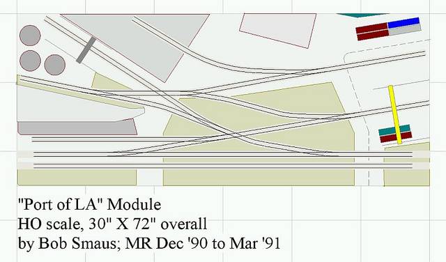
Smaus' "Port of LA" – Inspirational Layout #1

By 1990, I was thinking off-and-on about building what would have been yet another generic model railroad – but there was no real "spark" to my ideas. My coworkers and I frequented an Italian restaurant located in a shopping center alongside a hobby shop. After lunch, I would often wander into the shop and take a look at the magazine rack. What I saw while leafing through the December 1990 issue of Model Railroader literally froze me in my tracks. I actually momentarily felt as if I was in one of those scenes in a movie where a crucial newspaper headline whirls suddenly into view.


Bob Smaus' "Port of LA" project layout as described in Model Railroader Dec 1990-Mar 1991. Photo from the A-line/Proto Power West site.

Bob Smaus' photos of his 30"X72" HO module hit me hard. Here was a slightly gritty, workaday setting, down by the docks. Tracks purposefully crossed one another in a bustling industry scene. And all in a few square feet.


Click here for a better view of the HO module track plan

This was the firm, swift kick I needed to jump back into thinking seriously about the hobby. Real industries with real work to do — not generic-looking quaint little fantasy factories covered in novelty siding. And it seemed, well, buildable.

As I followed the project series over the next three issues I began to think more about why real railroads exist – to move goods from industry to industry, not just run around in circles. It helped that the Port of LA project was set in my home region of Southern California. So much of the rest of what I had been seeing in the model press at the time was Appalachian coal hauling and creaky Colorado narrow gauge. Smaus' little layout felt more like something to which I could personally relate. And although I didn't realize it at the time, the nascent seeds of a port railroad that had been planted years before were beginning to sprout. (More on that later in this series.)

Bob Smaus is a supremely talented modeler, skilled photographer, and a great writer (his day job was as an editor at L.A.'s major daily newspaper). He used all those skills to bring the Port of LA module to life in a way that affected me deeply. It's not an overstatement to say that I am in the hobby today because of seeing this series.

The Port of LA was also featured in the Kalmbach book 6 HO Railroads You Can Build. The module itself eventually found its way to A-Line/Proto Power West, where it has been used in promoting their products. And of course, Bob went on to build his fabulous SP Southern California themed layout (MR, July 2006, et al). [His very first layout effort hadn't been too shabby either: MR, Oct 1989.]

Of course, packing all of this action into 15 square feet of module that can also function on its own makes for a lot of compromises. In looking at the track plan now with more experience, I recognize the significant limitations of the multi-switchback scheme, where some industry tracks must be emptied before others can be switched. In fact, some industries would probably be disrupted just to use the convoluted runaround path. A container yard track only about 16" long in HO is pretty limiting, and it would certainly be more realistic to extend the layout into more space, creating "breathing room" between the different industries and easing some of these issues (as Mark Lawler did in building a representation of Smaus' Port of LA into his N scale layout).

But those practical layout design considerations and concerns were for another day, far down the road. As an inspiration, a motivator, even a slightly adrenaline-fueled model railroading jump start, Bob Smaus' Port of LA module takes a leading position in my list of Inspirational Layouts. And that crystal-clear San Fernando Valley Fall day in November 1990 when I first saw the layout article still ranks as one of my favorite model railroad memories.

Tuesday, September 09, 2008

Inspirational Layouts -- Introduction

Model Railroader magazine's year-long series on Landmark Layouts has been interesting. For the most part, I find the editors' selections hard to argue with. Most of these layouts and/or their builders changed the hobby for the better. In addition, most of these layouts are/were of very high quality (for their time) and advanced new ideas and concepts, from scenery to operations to replicating prototypes.

By the nature of the designation, the Landmark Layouts MR selected are something of a "best of" list. As I considered them, I found myself thinking about a handful of layouts that I have personally found uniquely inspirational. They are not the largest, most finished, or necessarily the most innovative — and some might not find their way onto anyone's list of top layouts for those reasons.

These are layouts (in some cases track plans only) that motivated me to build, that opened my thinking, and that helped me develop the vision and concepts for my current personal design. Note that these are not necessarily "perfect" designs. Many have elements (one might call them quirks or flaws) that would annoy me over time and I certainly wouldn’t choose some of those configurations for myself or a client design. But there is something about the overall approach that influenced me greatly when I first saw them and still does today.

There are many other fine layouts which I admire, an amazing number of which are within driving distance from me in the bay area (and one within walking distance!). They offer many lessons to be learned and operating experiences to enjoy. But the inspirational layouts gave me a creative whack on the side of the head and caused me to see the hobby, and my potential path within it, in a new way — even though many of these layouts and plans are much more modest.

I'll cover these inspirational layouts in blog entries over the coming weeks, sometimes with a track plan, and discuss the reasons they grabbed me and didn't let go. I'll try to communicate the positive and, well, inspiring elements of these designs, along with perhaps a few comments about their weaknesses. Watch for the first Inspirational Layout blog post later this week.

Wednesday, September 03, 2008

A Bridge (Route) too Far?

One of the interesting things about working with people on custom model railroad track plans is seeing the hobby from others' viewpoints. Sometimes it's a window back in time. A fellow has been conversing with me about a layout he'd like to set in the desert West, basically from Las Vegas to Reno. A look at a railroad atlas shows no railroad on that route – and a look at a highway atlas shows why.

This is pretty sparsely populated territory, to put it charitably. In fact, Darius Ogden Mills, one of the backers of the real life narrow gauge Carson and Colorado (which eventually became the SP's famous last remaining narrow gauge in the area) remarked that they had built their railroad "… three hundred miles too far or three hundred years too soon". And my prospective client's proposed survey seems just as remote, seeing as it mostly follows Route 95, called by some the loneliest road in America. (Nevada's connecting Route 50 vies for the same dubious honor).

OK, there would probably be some mineral and military business along the way (maybe the odd classified shipment of parts from downed UFOs to Area 51), but hardly enough to justify a four- or five-hundred mile rail investment in real life. When I met with the prospective client at the NMRA Convention in Anaheim in July, I asked, "So what were you thinking of as traffic generators on this layout?"

He looked at me as if I could not possibly have asked a dumber question. (For some reason, this happens to me a lot, so I am familiar with the expression). "Why, it's a bridge route, of course," he replied. "It connects the Union Pacific in Las Vegas to the Southern Pacific in Reno." Then he went on to name a number of well-known layouts based on the premise of connecting two Class 1s, noting that he could justify dozens of trains a day across the high desert based on the size of the two connecting roads.

Ah, yes, the pure bridge route. Famed in model railroading lore and relatively rare in real life. As I thought back, I remembered that when I was reading model magazines in the 1970s and 1980s, the bridge route concept came up a lot. Sometimes as an excuse for trackage rights (which is not the same thing as a bridge route, strictly speaking), sometimes as justification for heavy through traffic in an area otherwise lacking in on-line sources. And it's certainly true that this has been used as the basis for many layouts over the years.

Nowadays, many people recognize that the Class 1 railroads would rather keep traffic on their own rails as much as possible, so cars will be hauled hundreds of "extra" miles in a roundabout fashion to where the Class 1s have an existing connection and interchange. While there are a few true bridge routes that existed over the years due to accidents of ownership history or geography, they are pretty rare. Shortlines and smaller railroads are much more likely to exist as feeders to one or more Class 1s than as an alternate routing between them. I've mentioned Central California Traction and the Modesto and Empire Traction in the blog in the past. These railroads have connections to multiple Class 1s, but don't typically bridge traffic from one of those large railroads to the other. Instead, they connect their on-line industries to multiple Class 1s through interchange at multiple points.

This realistic pattern makes for a more interesting justification and concept to me than straining credibility with a bridge route, as well as creating more of the industry switching and interchange activity I enjoy. But hey, that's just me. And my client? Well, he's still itchin' for that dry and dusty bridge route, so we'll see how it all comes out. (And he's good-natured about seeing these musings on the blog) It will be a little time-travel for me back to the layout concepts of the '70s. Just hope I don't have to wear the clothes -- again.

Saturday, August 23, 2008

Remembering the First

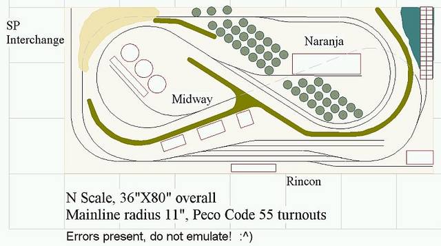
Ah, young love. So intense, at times so misguided. I was reminded of one of my first model railroad "crushes" the other day. Going through some old papers, I found a printout of my first serious layout design. It was done with crude turnout templates in Powerpoint(!) and probably dates from about 1989-90. I describe the plan as "serious" and not "good" because there are definitely some issues. But I remember being intensely focused on the concept for a few weeks. As with any old flame, some memories are more than a little embarrassing, but there are some warm thoughts, too.

I sketched out the plan in 3rdPlanIt and (remarkably) everything fits – but I resisted the urge to correct or improve anything. Twenty years later, some of the details are a little hazy anyway. The overall track locations were suggested by a layout I had seen in an NTRAK publication, which had a sort of a hilly pretzel overcrossing configuration separated by a backdrop from a narrow yard area along one long edge. Benchwork was to be a hollow core door. I had only just started thinking about the hobby again after a long time away and was considering N scale for the first time.


I had recently lived in Carpinteria, CA and the design vaguely suggests that area. The pier or wharf near Rincon was inspired by a short, high pier the Chevron company owned near Carpinteria to load men and equipment onto boats for transfers to the offshore oil platforms nearby. In my reimagining, this pier would somehow serve railcars. An interchange connection was imagined to the SP (which actually runs through the area) and the main on-line industries were citrus packing and some sort of oil-related industry. Both were important industries in the region. I tried to divide the small footprint into a few different scenes, although the backdrops might have proved a little tricky in actual construction.

I see a number of obvious things I would do differently today. The stub-ended yard tracks should point in the opposite direction, at least given where the interchange connects and where "Midway" is located. I think I may have imagined this as a shortline that would work the interchange, build a train, run out to Midway and Naranja, then runaround and return (or was it the other way around?). Too many tracks are parallel to the edges of the benchwork, and the model railroad cliché of "an industry track in every corner" is well-represented.

Hidden or secluded sections completed a continuous run and the roughly 2% grade should have been workable. I don't remember what I was thinking of calling it, but the "Rincon Northern" might have been appropriate (the California coast runs roughly East-West in the area). I also don't recall if I simply wasn't thinking of staging at that point or had purposely left it out in favor of the shortline-with-interchange idea.

This little plan was never built. I became involved with a friend's layout based on the Santa Maria Valley Railroad (see Model Railroad Planning 2004 or view the layout plan online here) and my own interests turned to more prototype-inspired designs. Looking back, I think it would have been a great boost for my own modeling if I had taken the time to build and operate this simple little project, even with the flaws. In any case, it was fun to revisit a past infatuation. [And a great way to procrastinate on the clean-up I was supposed to be doing the day I rediscovered this track plan.]


Speaking of firsts, I was enjoying Gillian Welch's album Time (the Revelator) last week. Her haunting bluegrass/folk/alt-county style with musical partner David Rawlings is well displayed in this album, which includes the slightly melancholy reminiscence "My First Lover". Welch might be best known for her work on the soundtrack to the movie Brother, Where Art Thou, but her music is a very intriguing mix and not limited to old-timey tunes. Rawlings adds sparse but moving fills and creative leads on acoustic guitar that build the atmosphere of each tune. Great record!

Friday, August 15, 2008

Cardiff Giant Layouts and other Fairy Tales

The Internet is a mixed bag for model railroading. It provides tremendous benefits in research and information. But it has also given rise to a particular brand of tall tale that just leaves me shaking my head. Every few months a thread surfaces in a forum describing someone's plans to build a big layout. And when I say "plans", I really mean, "hallucinations".

Many of these folks don't actually have the skills or time available for such an undertaking, and almost by definition they don't have the financial wherewithal. But they are just sure the owner of that abandoned lot behind Aunt Tilly's house won't mind if they throw up a post frame mini-warehouse and start building a layout.

Next come weeks of on-line hand-wringing over which brand of locomotives are best suited to the envisioned 60 scale miles of main line, what manner of sheetrock screws to use to build the mezzanine for the crew lounge, and whether an elevator or just an escalator would be preferable to move operators between the three levels of layout without falling too far behind their train. And how will we build floor supports for the hot tub in the dispatcher's office?

And the forum-ites jump right in – offering that particular wild mix of speculation and overwrought amateur engineering that the Internet incubates like fungus in a fetid hothouse. Soon the forum is filled with talk of gluelam beams and solar panels vs. in-house biomass co-gen plants for powering the twenty-five thousand kilowatts of layout lighting. Heady stuff, that!

And somehow, nobody ever asks a few simple questions of the original dreamer. Is there really time, space and money for a project of this scope? How long will it take? Are you at a place in your life where you are sure that future education, job opportunities or relationships won't require a move within that timeframe? Might you not be better off with a more modest layout today, perhaps built in sections, to allow for life's twists and turns? Nope, everybody's just too happy to go along with the fantasy.

After a few weeks or months of delirium, the original poster and his grandiose dream disappear, undone by some unforeseen reality check. And then the next romantic arrives and the process begins anew.

Why do so many join in, when most must know that what's being proposed is unlikely at best? I guess we all want to believe in fairy tale giants – creatures bigger and more powerful than mere mortals. George Hull's Cardiff Giant was an elaborate hoax that tens of thousands bought into at 50 cents a pop, to the tune of $30,000 (in 1869 dollars!). Fossilized stone giants might be slightly harder to accept than the quixotic plans of some model railroad dreamers, but it seems there is always a gullible crowd for Gulliver‑esque layout fables.

Monday, July 28, 2008

Beverly Hills 502.50

It’s known more for movie stars, shopping, and as the location for a slightly sleazy 1990s TV show, but there was also a gritty side to Beverly Hills. And no, I’m not talking about Jed and all his kin. It turns out there was some real-life railroading going on in Beverly Hills (SP Milepost 502.5), Santa Monica, and West Los Angeles into the 1970s.

Mike Jarel has written a very interesting article in the most recent Trainline magazine (#96, Summer 2008), published by the Southern Pacific Historical and Technical Society, that traces the area’s history as remnants of the Pacific Electric’s interurban service (among others). Jarel grew up nearby and worked on the SP in the area, so the article is definitely written from a knowledgeable perspective.

By the 1960s, Southern California was booming and the need for rail deliveries of building materials, appliances, food products and the like was growing rapidly. Pacific Electric operated its own freight service (dieselized after 1956) in what it called the Western District until the full absorption into the SP in 1965, when the parent road took over operations.

There were small yards, runarounds, some street running, and a variety of industries sprinkled around the area. I’m really fascinated by these small urban terminal switching areas, and this is another example from a somewhat unlikely locale. The small yard at Sentous (near the intersection of today’s San Diego and Santa Monica Freeways) served multiple locals, with haulers from the larger downtown yards picking up and setting out blocks of cars. The industries and railroad facilities were of model-able size and included some very recognizable customers.

A series of Free-Mo modules duplicating some of these areas would be a great start on a model railroad that could be easily expanded or might have to be moved one day. By coincidence, my friend Trevor Marshall’s article in the August 2008 issue of Railroad Model Craftsman describes just such an approach (based on a different prototype and area, Peterboro, ON). Sentous yard could be modeled or represented by a pivoting sector plate as Trevor and Pierre Oliver did on the Peterboro project.

An approach like this could certainly provide more long-term operating enjoyment than the mindless loops on plywood sheets usually promoted by the commercial press for modest layouts. But don’t get me started on that. Instead, kudos to Mike Jarel, Trainline and its editor John Signor, and to Trevor Marshall and RMC for showcasing some very interesting prototypes and layout concepts this month.

Thursday, July 10, 2008

See you in Anaheim

For those of you planning to attend the NMRA Convention next week in Anaheim, I hope you’ll drop by one of my clinics to say hello. I’m presenting two clinics, “Creating an Operating Session” and “Layout Design from the Prototype”. I’m also participating as a panelist with a number of former editors of the Layout Design SIG’s Layout Design Journal to discuss “Layout Design Trends”.

The operations-oriented clinic will attempt to cover everything from car movement to train control to crew management and human factors. Obviously, an hour-long clinic will just scratch the surface of the topic, but hopefully it will be useful for those beginning to explore operations on their own layouts.

The clinic on designing from the prototype will hopefully interest those considering prototype-based layouts, freelanced layouts, and everything in between. I’ll try to share a bit about the thought process I find myself going through with most projects. Model railroad layout design is all about the trade-offs and compromises, and there are multiple junctures in the process where this comes into play.

The layout design trends panel discussion (Tuesday at 4pm) will be an interesting look inside the minds of a number of accomplished modelers and hobby thinkers. And me. Some preliminary email discussions among the panelists suggest that we will bring at least a few different viewpoints to the table. Model railroad layout design ain’t rocket science, but there are some interesting new ideas as well as older ideas being applied in new ways.

Hope to see you there.

Greatest. Baseball. Announcer. Ever. I’ve been spending time in Southern California recently helping out with some family matters and have had a chance to catch a few L.A. Dodgers broadcasts. Even though I was always much more of an Angels fan growing up, Dodgers broadcaster Vin Scully is still the very best there has ever been at his craft, in my opinion. Scully never over-hypes a moment and has an instinctive knack for drawing the listener or viewer into the game with a pertinent fact or stat delivered in a relaxed and engaging manner.

Scully gives the game itself “room to breathe” – and with that, he smoothly communicates the ebb-and-flow rhythm that’s the natural pace of baseball pitch-to-pitch. It’s like watching the game with an old friend who happens to be incredibly knowledgeable (and has a research team backing him up). I imagine Scully will be retiring sometime soon, so it’s been great to have a chance to enjoy his understated excellence again. Thanks, Vin!

Tuesday, July 01, 2008

Modules and Sections and Dominoes, Oh My!

This is going to be one of those model railroad layout design screeds that makes me feel slightly better but has no discernible impact on the hobby whatsoever. Ready? Here goes: the terms in the title above are not synonyms!!

Sections are just what the name implies. They are chunks of layout. They’ve been built separately for easier transportation, construction, etc. They often have legs so that they may stand alone, but could be suspended from a wall or between other sections. Sections may be flat-topped or open grid or some combination or variation. (Typically, they are not L-girder for obvious reasons.) Sections may be any shape or size. A sectional layout typically is built to fit together in one particular configuration – the sections are not interchangeable without some rework or addition of new bridging sections for a new space.

Modules are sections of layout that have been designed to a standard like NTRAK, Free‑Mo, or (many) others so that they may be interchangeably combined with other modules to form a layout. Some of these standards are national or international in scope, others defined by a single club, informal group, or individual. These standards define the track and electrical connections for mating ends. In some cases, the size and/or aspect ratio of modules are specified, but this is not universal. Adjoining modules may be built by the same or different people … but the interface between them is standardized. That’s what makes them modules. Sometimes people choose to build multi-module sets where the intermediate interfaces may not be built to the standard, but the ends are, to permit connections with modules built by others. The key is the standard interface at the ends. Ergo, all modules are sections, but not all sections are modules.

The term “domino” was borrowed by David Barrow to describe 2’X4’ flat-topped layout sections with legs. See, they look like a domino – with the flat top and 2X4 aspect ratio – just like a domino, get it? Thus, all dominoes are sections, but not all sections are dominoes. (By the way, dominoes may be an OK way to build some types of layout, but they are a really bad way to design a layout, in my humble opinion. But that’s a rant for another day.)

["Doorminoes", by the way, are a pretty cool idea: layouts or layout sections built on hollow core doors. Doorminoes have been used and popularized by Dave Clemens, among others.]

Let’s review:
- Sections are chunks of layout; size, shape, and track and electrical interfaces between sections are not standardized
- Modules are sections built to a standardized defined trackwork and electrical interface for interchangeability
- Domino is a term to describe a specific aspect ratio flat-topped section

OK, got it?

Hey, I do feel a little better.

Thursday, June 19, 2008

Constraints make you clever

I just finished one model railroad layout design project and I’m in the middle of another that seem not to have a lot in common. The first was a reworking of a traditional style HO 5X9 layout into a slightly longer space. But the owner wanted to keep the “old-school” feel and features: a main oval, reversing loops and connections, no staging, etc., etc.

The other is an HO layout of a specific real-life railroad, locale, and era. The space is large, but irregular, with a number of doors, obstructions, and areas that must be kept clear. On-hand engines are finicky, so larger radii and turnouts are the order of the day.

The common link between these two projects for me? Constraints -- those sometimes-frustrating “givens” that one must deal with in coaxing a satisfying layout into a specific space. With the traditional design, it was a matter of managing radii, track-to-track spacing, and (especially) grades, all the while creating enough "breathing room" for some operating interest, scenic opportunities and some on-hand structure kits. An inch or two can mean a lot.

In the larger prototype-based layout, we’re trying to balance the desire for somewhat accurately depicting a number of scenes over nearly 200 miles of real-life railroad within the realities of finite space and the minimum radius demanded by the brass locomotives. The optimal location for a turnback loop squeezes aisles and adjoining benchwork uncomfortably. Here, too, an inch or two can mean a lot.

In turns out that I really enjoy working through these kinds of challenges. (Good thing, too, because they seem to crop up in every project.) It’s hard for me to relate to the interest some find in crafting pie-in-the-sky plans for oversized spaces they’ll never actually have. What’s the fun of layout design in a gymnasium? (Check that, if you happen to have a gymnasium, I’m available and happy to help.) To me, it’s exciting to finally come upon a great way to coil things into the space after trying a lot of alternatives and to suddenly see opportunities for locating specific scenes at an appropriate bend in the resulting benchwork footprint.

Working with constraints makes you clever, I think. Experts in brain morphology and function tell us that exercising our brains in different and challenging ways helps our brains stay younger. My layout design gray matter is getting a pretty good workout lately – gotta feel the burn.

I had the chance a few weeks ago to hear dobro master Jerry Douglas in concert. His music defies categorization to some degree, but springs from bluegrass roots (as evidenced by his long-standing collaboration with Alison Krauss and Union Station). His band was first class (but why do the lead guitar players always have it cranked up to 11, no matter the venue?) and Douglas has a very dry sense of humor that illuminated some of the playful spirit in his tunes. He is widely regarded as the best to ever play the instrument, and it was a joy to experience the virtuosity in real life. The new CD is titled Best Kept Secret and goes a bit more in a jazz direction than some of his earlier work. I’m slightly more partial to the more blues- and bluegrass-inflected albums, but it’s still a keeper!

Thursday, May 08, 2008

It was the Pantry

Yes, the pantry finally did it. When the previous owners remodeled the kitchen in our 40+ year old house some fifteen or so years ago, they chose the least expensive cabinets available. Pressed wood and staples -- and not enough of either. From the time we moved in, the cabinets have been slowly returning to their primordial state, that is to say, literally disintegrating.

Five-minute epoxy and aluminum mending plates have served to fix some of the major cabinet crevasses over the years we’ve been in the house, but a few months ago there was a huge crash from the kitchen. One wall of the pantry had decided to part company from its loosely-coupled companions and the large shelves crashed to the bottom like falling floors in a Warner Brothers cartoon. Off to the hardware store for threaded rod and metal plates (and more epoxy), and the pantry was soon back to some semblance of function. [Oh yeah, and company was coming that evening for dinner. No kidding.]

But that was the last straw for the lovely wife, who started using profanity like “kitchen remodel” and “push out that wall”. And so we’ve started down the long twisted path of major home improvement.

“What’s this got to do with model railroading?” one might reasonably ask. Some may remember the famous poem “For the Want of a Nail”, republished in Benjamin Franklin’s Poor Richard’s Almanack. The basic premise of the rhyme is that the loss of a nail leads to the loss of a horseshoe, then the horse and rider, then a battle and ultimately the loss of a kingdom – “all for the want of a nail”. The pantry collapse is sort of like that – the first step in a long sequence of events. With the pending remodel, the garage where my layout is situated could become quite crowded. If the remodel is just the kitchen, crude temporary cooking facilities and boxes of dishes, pots, and pans will fill the space. If the remodel is even more extensive, some furniture will be stored there. In any case, not much layout building will get done for a while, at least not in the garage.

I’ve known in the back of my mind that this was a likely scenario, but I was able to keep it way back there. But the impetus for layout construction has certainly diminished since the pantry’s unfortunate breakdown with the knowledge of what was likely. So what to do?

While pondering this question, I thought about advice I’ve given to my own model railroad layout design clients when faced with some unexpected space upheaval. “There’s always some way to build something,” I cheerily encourage them. I hate it when my words come back to mock me. But maybe there is a way. After all, friend Bart Thurber found a way to use a storage room at his business for a no-muss/no-fuss representation of ATSF’s Alice Street Yard on shelves above the storage.

Our guest room doubles as an office and has a couple of long walls. Hmmm. Perhaps a narrower desk, since I’ve moved from a CRT to a flat-screen monitor. Maybe a few sections of layout built on shelves along the walls with a bridge across the window. That could work. But what to put on those shelves? HOn3 Hawaiian railroad … no, back, away, foul spirit!! OK, so let’s stay with the Oakland Harbor Belt theme, era, and N scale so I can use the on-hand locos and rolling stock. Maybe sections of the layout that might even be useable in the garage later. (Or in a dedicated train room if the remodel turns extensive – or is that expensive?).

OK then, what to build? Fernside Yard and Alaska Basin could probably fit, but not in configurations that readily transfer to the ultimate garage plan. So how about Brooklyn Basin? (Click here for a better view of the Brooklyn Basin map.)


This proto-freelanced area sports some interesting possibilities, with a huge flour milling complex, canning company warehouses, a massive glass plant and a marine terminal. In real life, the SP (and now UP) served the area, but I’ve always imagined modeling coopetition here with the OHB and SP jockeying for customers.
Let’s see… the Fruitvale Ave. lift bridge (above, from Microsoft Live Earth), glass plant (upper left in the photo), and canning warehouses (lower left) along one short wall, narrow bridge for Glascock Street across the window, then the major milling complex and marine terminal along the long wall. As Gene Wilder’s Froederick Frankenstein screams in the movie Young Frankenstein, “IT … COULD … WORK!!!”

Stay tuned.