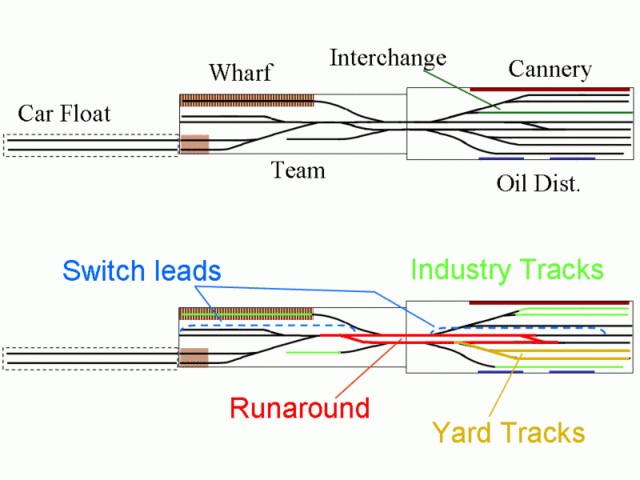
Real railroads are relatively long and skinny, and that's even true for terminal and switching areas, for the most part. The width of right-of-way might only be 100 feet or so (just over a foot in HO). But the length, of course, is tens, hundreds, or thousands of miles. What this means is that most model railroads have significantly more width (or depth) than length compared to the real thing.
The original question in the forum was regarding layout design for a small switching layout. But this principle applies to model railroad layouts of all sizes and configurations. So often, folks miss the opportunity to get more into the available space by neglecting to overlap some elements in the same running length of layout. Instead, they plop down things one after another in a linear fashion. Now it's true that real railroads are more or less arranged this way, but we're always so starved for length on the model that it can help to look for tricks that help compress the length with some judicious overlapping of elements.
Now this does not necessarily meaning placing one "town" behind another on the same shelf, but to look for places where some elements in the same area can overlap, taking advantage of our relatively deep scenes (compared to the length). Here's a small shelf-style layout (about 2'X12' in HO plus the removable car float), but it illustrates the way the different functions (yard, switch lead, industries, runaround) overlap to some degree in the same linear space.

For a better view, click here
Note how each element overlaps some other element. The industry tracks (bright green) serve a series of flats, both against a backdrop and toward the aisle ("fascia flats"). Of course, when there is a little more depth, one can mix in larger 3-D industries as well. But there can still be overlap with yard tracks, switch leads, etc.
An improved version of this concept was published as a folding 1'X6' N scale design in Model Railroad Planning 2005. It's inspired by the erstwhile real-life Alameda Belt Line. Here's the version I submitted to MRP, their artwork was much nicer.

Read more about this design here
So look for chances to overlap where it doesn't compromise the operating potential or appearance of a scene. (And I don't mean the overlap above your belt … we all need to get rid of those …)