I had an interesting project with a client a year or so ago. He was picturing a rectangular layout in a rectangular space that allowed only a minimum of space for rectangular aisles on three sides. Sound familiar?
We had a lot of discussion on the layout footprint and we were able to encourage him to accept a more "organic" shape. In this case, sort of a "boomerang" or "kidney" outline that fit into one corner of the room.
The curving benchwork gave him more room for construction, operation, and maintenance. And I thought it certainly a lot more interesting visually than yet another monolithic rectangle layout.
Although he had to work out some interesting challenges in construction (for example, adding a third L-girder a la Linn Westcott), my client reports that construction is well along; track is laid and wiring is underway.
And how does he feel now about that curvilinear benchwork? In his own words, "… it looks a lot better than a roundy-roundy rectangle!"
[Watch for the layout plan story in a future issue of the commercial press …]
Monday, February 22, 2010
Friday, February 19, 2010
The Double (Track) Cross
For the majority of readers who visit this blog (thanks, by the way), this post is of no particular use.
But I see this error over and over again on user-posted track plans, so if it helps only one or two folks before they permanently fasten down their track, it's worth it.

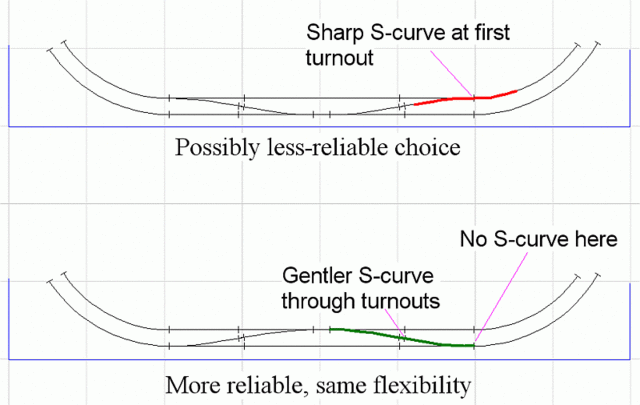
The top configuration in the drawing above is often seen on newcomers' double-track ovals and other areas where double tracks curve into a set of crossovers.
Because the tighter inner end curve feeds directly into an opposing crossover, it creates a possibly troublesome S-curve, especially when shoving longer cars through. The alternative arrangement on the bottom of the drawing offers the same routing flexibility but creates much gentler S-curves.
Note that the same problem can develop when newcomers place an off-the-shelf double-crossover too close to a tight curve, not realizing that one route creates a significant S-curve.
Yeah, I know it's kind of a basic point -- thanks for indulging me.
But I see this error over and over again on user-posted track plans, so if it helps only one or two folks before they permanently fasten down their track, it's worth it.

The top configuration in the drawing above is often seen on newcomers' double-track ovals and other areas where double tracks curve into a set of crossovers.
Because the tighter inner end curve feeds directly into an opposing crossover, it creates a possibly troublesome S-curve, especially when shoving longer cars through. The alternative arrangement on the bottom of the drawing offers the same routing flexibility but creates much gentler S-curves.
Note that the same problem can develop when newcomers place an off-the-shelf double-crossover too close to a tight curve, not realizing that one route creates a significant S-curve.
Yeah, I know it's kind of a basic point -- thanks for indulging me.
Friday, February 12, 2010
Does this yard make me look fat?
Some questions are basically unanswerable; the stereotypical classic is when your spouse asks, "Do these pants make me look fat?"
I have been reminded of these types of unanswerable questions in the last few weeks on various Internet forums. Folks post a track plan for a yard (often a simple mechanical transcription of one of John Armstrong's plans from Track Planning for Realistic Operation). Then they ask, "Is this a good yard plan?"
I dunno. Maybe. Maybe not.
There are quite a few facts not yet in evidence. Where is this yard located in relation to staging, junctions, branches, and other yards (if any)? How many trains will this yard serve in a session? In which direction will most trains run? Will this yard originate or terminate trains? How many trains? What types of trains? How much classification is needed versus simply block swaps? What era?
Without the answers to these and other questions, there's really no way to make an accurate judgment about the suitability of any yard design for a specific layout.
Of course, this doesn't stop the self-proclaimed forum experts from adding their two cents, advising various additions and changes that may (or may not) improve that yard's function in a specific layout.
While the classic Armstrong designs are better than 98+% of what most modelers dream up on their own, I hate to see this kind of unanswerable yard design question receiving so many pat (and patently incorrect) answers.
The right answer ("It depends, let's look at the rest of your layout design and your operations concept.") won't satisfy the typical immediate-gratification help-seekers -- but it is the reality of plausible, efficient, and engaging yard design.
Saturday, February 06, 2010
Plans of Steel
Over the years, I've had a few requests for layout designs that included some elements of the steel industry. While I have gleaned enough from back issues of the Railroad Industry SIG's publications and articles published in the commercial press to do a decent job, a couple of recent projects have demanded a more intense focus on the steel industry.
 So I'm really grateful that the NMRA arranged for the reprinting of Dean Freytag's The History, Making and Modeling of Steel. It also helps that the book is very focused on the Walthers steel industry models in HO scale and N scale, since most of my clients want to at least start with these kits as a basis for their modeling.
(Between the time I started writing this blog entry and today, I discover that the book is sold out at the NMRA -- sorry about that. Perhaps interested readers will be able to find it from other sources or through inter-library loan.)
One of the nice things about Freytag's approach in the book is that he offers a lot of variations. Whether the modeler's preference is for detailed prototype replication or something more casual, lots of space dedicated to the steel industry or just a corner of the layout, Freytag offers useful advice for all. And he offers these suggestions in a positive and encouraging way that many modelers will find motivational.
Another very helpful part of the book is its focus on explaining in some (although not excruciating) detail the steel making process. Even this modest amount of background makes obvious the flaws in many steel-oriented published track plans.
I understand Bernie Kempinski has a book on the steel industry in the publication process and I'm sure that will be a good resource as well. But I wanted to take a moment to acknowledge Dean Freytag's excellent scholarship and spot-on writing tone, perfect for the modeler. Hopefully the book will become more readily available again.
 I've written before about Allman Brothers member and recent Eric Clapton sideman Derek Trucks. I've been enjoying the Derek Trucks Band's most recent album, Already Free. Although the jazz and world music elements are still evident in Trucks' fabulous slide guitar sound, this album seems to me to have more blues and rock influence. Whether it's the easy acoustic shuffle that phases into a driving electric rock riff in "Down in the Flood" or the greasy slide that powers "Get What you Deserve", many of the tunes show a bit more muscle this time out.
Also welcome to my ears are the vocal contributions of Clapton bandmate Doyle Bramhall II (who also wrote and produced some songs on the album) and Trucks' talented wife Susan Tedeschi. While I enjoy regular vocalist Mike Mattison, I find the variety of vocal styles really accents the wide range of Trucks' playing in this, my favorite Derek Trucks album to date.
 So I'm really grateful that the NMRA arranged for the reprinting of Dean Freytag's The History, Making and Modeling of Steel. It also helps that the book is very focused on the Walthers steel industry models in HO scale and N scale, since most of my clients want to at least start with these kits as a basis for their modeling.
(Between the time I started writing this blog entry and today, I discover that the book is sold out at the NMRA -- sorry about that. Perhaps interested readers will be able to find it from other sources or through inter-library loan.)
One of the nice things about Freytag's approach in the book is that he offers a lot of variations. Whether the modeler's preference is for detailed prototype replication or something more casual, lots of space dedicated to the steel industry or just a corner of the layout, Freytag offers useful advice for all. And he offers these suggestions in a positive and encouraging way that many modelers will find motivational.
Another very helpful part of the book is its focus on explaining in some (although not excruciating) detail the steel making process. Even this modest amount of background makes obvious the flaws in many steel-oriented published track plans.
I understand Bernie Kempinski has a book on the steel industry in the publication process and I'm sure that will be a good resource as well. But I wanted to take a moment to acknowledge Dean Freytag's excellent scholarship and spot-on writing tone, perfect for the modeler. Hopefully the book will become more readily available again.
 I've written before about Allman Brothers member and recent Eric Clapton sideman Derek Trucks. I've been enjoying the Derek Trucks Band's most recent album, Already Free. Although the jazz and world music elements are still evident in Trucks' fabulous slide guitar sound, this album seems to me to have more blues and rock influence. Whether it's the easy acoustic shuffle that phases into a driving electric rock riff in "Down in the Flood" or the greasy slide that powers "Get What you Deserve", many of the tunes show a bit more muscle this time out.
 Also welcome to my ears are the vocal contributions of Clapton bandmate Doyle Bramhall II (who also wrote and produced some songs on the album) and Trucks' talented wife Susan Tedeschi. While I enjoy regular vocalist Mike Mattison, I find the variety of vocal styles really accents the wide range of Trucks' playing in this, my favorite Derek Trucks album to date.
Monday, February 01, 2010
MRP 2010 -- The "Lost Photos"
 I am very pleased to have two of my layout designs featured in Model Railroad Planning 2010. The first track plan is part of a very interesting article on the Richmond Pacific Railroad (RPR) by lead author Bill Kaufman.
The RPR was the subject of our Layout Design Challenge at the Bay Area SIG Meet in 2006. Different designers prepared versions of the RPR (or its predecessor Parr Terminal RR) for presentation and discussion at the meeting, in one of three defined areas. The MRP article combines a discussion of today's RPR with a number of those layout designs and a brief description of each by the designer.
My own contribution is a portable N scale switching layout based on the Parr Terminal and sized to fit on two standard folding banquet tables. Editor Tony Koester and the team at Kalmbach did a great job of turning a slightly clumsy collection of materials into a well-presented article.
For my second article ("Dallas on a Door") … well, let's just say that not all articles go even that smoothly. The compact N scale design captures key elements of the Missouri-Kansas-Texas ("The Katy" or M-K-T) in downtown Dallas on a hollow core door in N scale. Neat prototype, great client, nifty compact switching design. So far, so good.

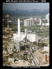
But finding photos to illustrate the article proved to be much more difficult than expected. There were plenty of images on-line (like the one to the right). But locating photographers, clearing copyrights, and obtaining high-quality versions of the images proved daunting.
In the end, Kalmbach had to substitute some on-file material to help illustrate the article. Frustrating! (Now, I'm sure it's not just me that Editor Koester is writing about in his MRP 2010 editorial when he admonishes prospective authors about having their photos lined up before submitting. At least, I hope it's not just me!)
Oh, and sorry about that, Tony!
Subscribe to:
Comments (Atom)